Evaluation of the quiz results and recommendations on how to increase conversion.
Role
Regina Rakhlin - UX & UI Direction
Stakeholder
Color & Co. VP of Marketing
KPI
Increase conversion from quiz results to checkout.
The Problem
Upon completing the haircolor subscription quiz, few customers convert at this juncture and add product to cart.
• • •
The Product
L'Oréal's lab company, Color & Co., custom hair-color subscription website recommendations for improved conversion into the checkout.
• • •
The Solution
Leveraging my extensive eCommerce experience, UX guiding principles, and design best practices, I documented and designed recommendations for improving the current state of the hair-color quiz result page.
L'Oréal loved the recommendations, appreciated the insights, and proposed a working relationship.
The Overview
Current State
UX Opportunities
Subscription website for custom hair colors. Customers came to the site, completed the quiz, but it did not convert much past the results page.
01
Display content based on customer expectations.
• Top message of quiz results is a generic message.
• Quiz results requires scrolling...customer friction.
02
Build predictable navigation.
• Native browser back button restarts quiz experience.
• Challenging experiences result in site abandonment.
03
Include relevant info for a confident purchase.
• Does a customer know price of product?
• Should the customer know how process length?
• Would customer reviews be of interest?
• Might Risk-Free Return help with purchase commitment?
04
Ensure content hierarchy.
• Results don’t appear at the top, they’re halfway down the page.
• New Color Goal is visually associated with the checkout button.
05
Provide concise content & communication.
• Eliminate redundancy.
• Enable text scanning, rather than requiring reading.
06
Exclude or minimize less important content.
• Too many choices, dilutes focus and takes off task.
• Figuring out content may cause abandonment.
07
Focused & clear call to action.
• Quiz results & the next page have the same CTA.
• Call to action buttons set customer expectations.
Future State
UX Designs
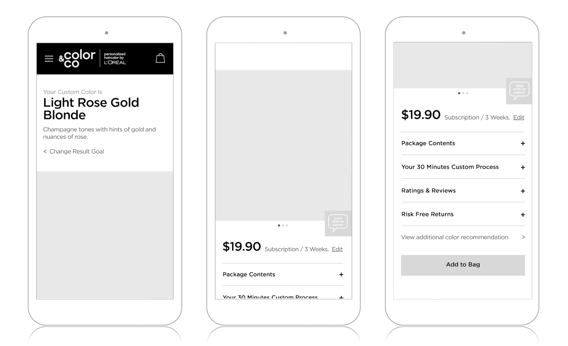
Even though this site is a subscription business model and essentially one product is being marketed, the customized aspect is unique for each customer and the personalized feeling should be clearly communicated. Also, since a product is the result, the format of the page should have a resemblance to key components of a product detail page.
Wireframes
User Interface Designs
01
Leverage native browser controls.
• Browser back button should be predictable.
• Preserve customer selections to enable updates.
02
Lead with specific quiz result information.
• First display, recommended color name & description.
• Meet customer’s expectations post quiz completion.
03
Associate color result with the ability to modify it.
• Enable simple flow back, if the result is not desirable.
04
Photography shows product as “King”.
• Product alternate views offer clarity & product details.
• Customers shop primarily via visuals.
05
Display price information & details.
• Price is an essential component when deciding to buy.
• Enable simple modification of subscription frequency.
06
Ability to chat with a specialist at anytime.
• Access to a floating chat button for convenience.
• Service details would display on a subsequent page.
07
Offer product details for a confident purchase.
• Description of package contents.
• Time commitment transparency.
• Access to other customer product feedback.
• Benefit about no concerns if not satisfied.
08
Simple access to additional recommendations.
• Keep customer moving toward checkout.
09
Primary call to action is Add to Bag.
• Natural progression at this juncture is add to bag.
—— All Project Samples ——

