Digital & physical products connected experience
— MAC Cosmetics
(Brand of Estée Lauder Companies)
UX Case Study
Roles
Regina Rakhlin - CX Strategy / UX Director
Fabian Schwall - Creative Director
Oscar Gomez - Technology Lead
Kevin Pan - Sr. Project Manager
Client
MAC Cosmetics
KPI
Increase store engagement,
product conversion & repeat visits
The Challenge
MAC was seeking to simplify how customers shop & purchase makeup while having a more engaging brand interaction.
Reimagine makeup styles with a unique approach. Create an immersive shopping experience, beginning with customers exploring complete looks, then purchasing the products that create them. Freedom to play & discover by connecting physical products with the digital world.
• • •
Hypothesis
We believe by creating a suite of connected experiences for the MAC Cosmetics customer, they will understand the product assortment and find desirable product(s) effortlessly.
We’ll know this is true when there will be an increase in conversion at the Queens Center location.
01 : Understand
Create an innovative way for customers to engage with the product assortment. A new digital experience would be piloted at the MAC Cosmetics concept store in Queens Center Mall. The positive learns from this test lab would cascade to the rest of the store fleet.
Current customers would either browse briefly or focus on purchasing an annual replenishment item. Engaging with new products or other categories was lacking.
• • •
To address these and other issues the requirements for the new digital experience were based on collaborative brainstorming with the stakeholders, marketing & omnichannel leadership, as well as customer insights.
02 : Ideate
The requirements identified were organized and associated with the relevant experiences. Creating a streamlined flow
within a single as well as across all products would enable predictable experiences.
To avoid friction the similarities were intended to flow & function identically; the differences would later be considered based on context.
Maintaining simplicity became a challenge as customer needs versus business objectives would occasionally conflict. Gaining client trust through the process was an ongoing effort. However, through sharing previous insights and best practices, we were able to achieve alignment.
“...what they need, when they need it in the most straightforward way possible.”
03 : Prototype
“...usability & learnability improve when similar elements have consistent look and function”
▲ Wireframes of each Experience
Created to visually illustrate, wireframes showed how consistent components would be leveraged across pages, and produce scalable page structures. These visuals achieved rapid approval and the ability to advance into the next sprint.
Multiple benefits for repeated components: reduce the customer learning curve, lessen friction, and optimize the development during the initial build.
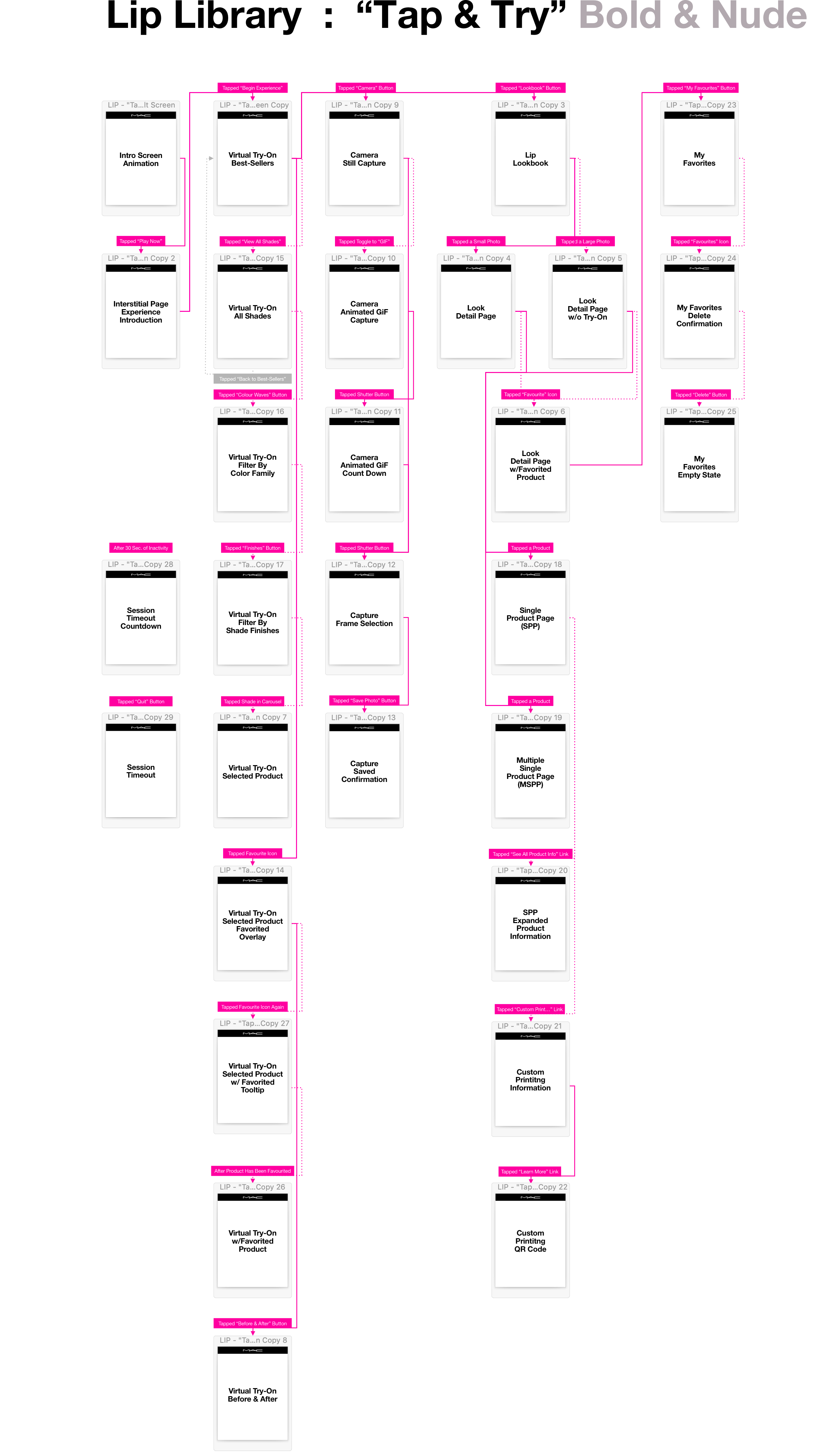
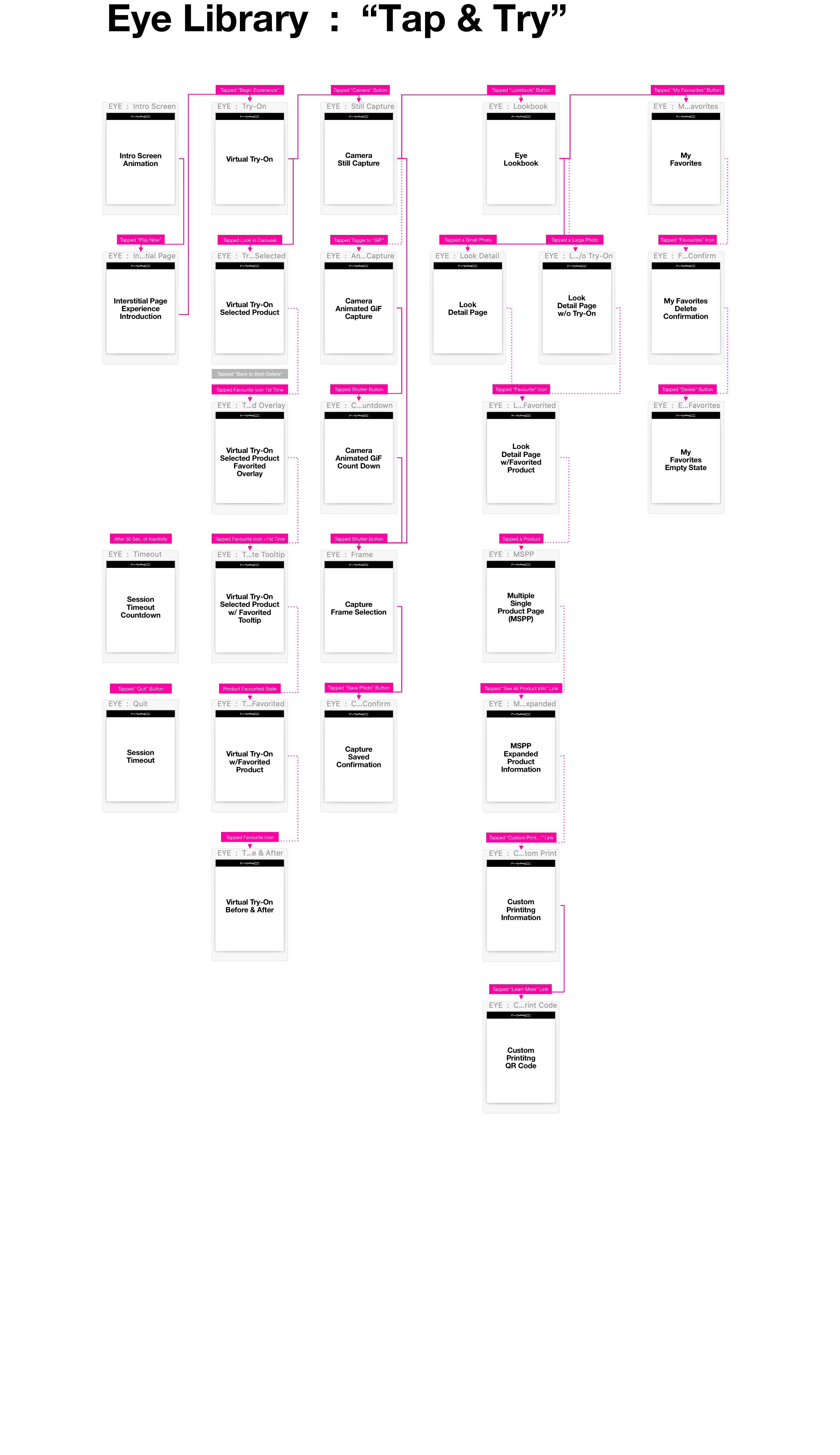
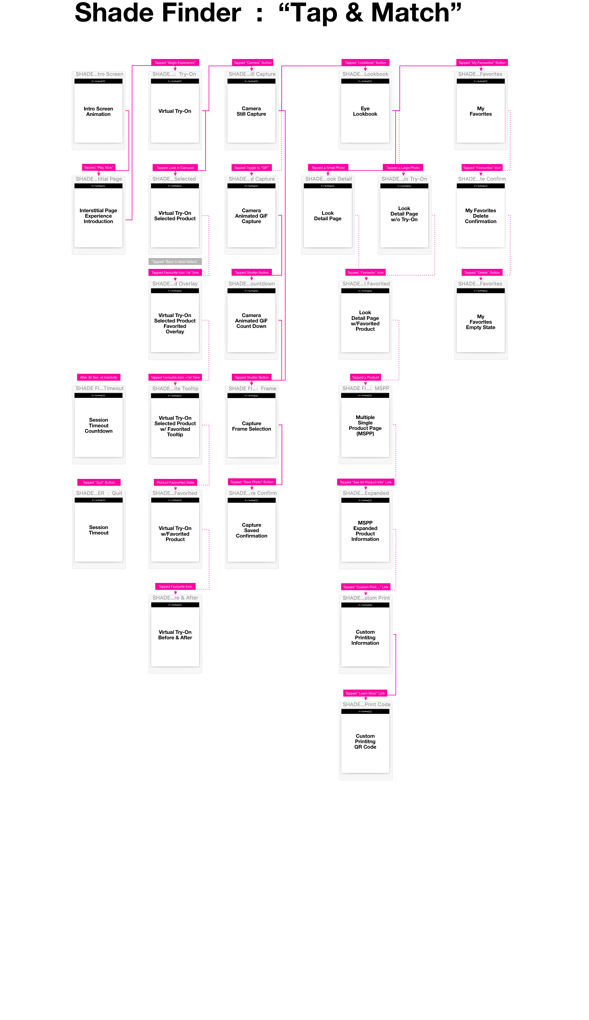
▼ User Flow of Experiences
The client requested flows to vary based on experience, but during exploration, it was evident that having consistent flows created a predictable experience across all products.
The consistent flow approach was recommended verbally to the client, however, they insisted on their original request.
To help illustrate the benefits of the consistent flow more clearly, a low-fidelity click-thru was created.
While interacting with the click-thru, the client was able to understand why the consistent flow approach “felt better”, therefore we were able to align.
04 : Usability Testing
The intent was to have 2 formal usability rounds and a several informal usability sessions. Formal usability testing plans were halted due to COVID-19.
Validating the product was desirable, by sharing with unfamiliar partners useful feedback was gathered. In addition, weekly design presentations and bi-weekly build reviews with the client & stakeholders provided additional comments. All was used to make design iterations with options for the client to provide final approval.
“...predictability plays a big part in reinforcing self-assurance... a stronger sense of control... requires less mental effort... puts them at ease.”
▲ Usability Test Matrix
05 : Results
Documentation & Development
Centralized documentation was created to maintain clarity on decisions, including designs, functionality, content, copy, and new requirements.
This level of detail was maintained and referenced within Confluence to serve as a single source of truth for agile development, design iteration, and approval.
• • •
During Development
As each sprint was approved, the development would begin on those components & templates.
However, UX did not stop there, during each client demo various opportunities were identified.
For example, the bottom navigation needed to have clearly defined states for each page & scenario. They were on-state, active, inactive, and selected states.
As each sprint was approved development would begin on those components & templates. However, UX did not stop there. During each demo, we (& client) would identify opportunities. An example of such an opportunity was the bottom navigation buttons.
Documentation was essential to maintain clarity on all the aligned decisions. This included designs, functionality, content, copy and of course new requirements. This level of detail was maintained and reference within Confluence. Centralized documentation was created. A single source of truth for agile development and design iteration and approval.
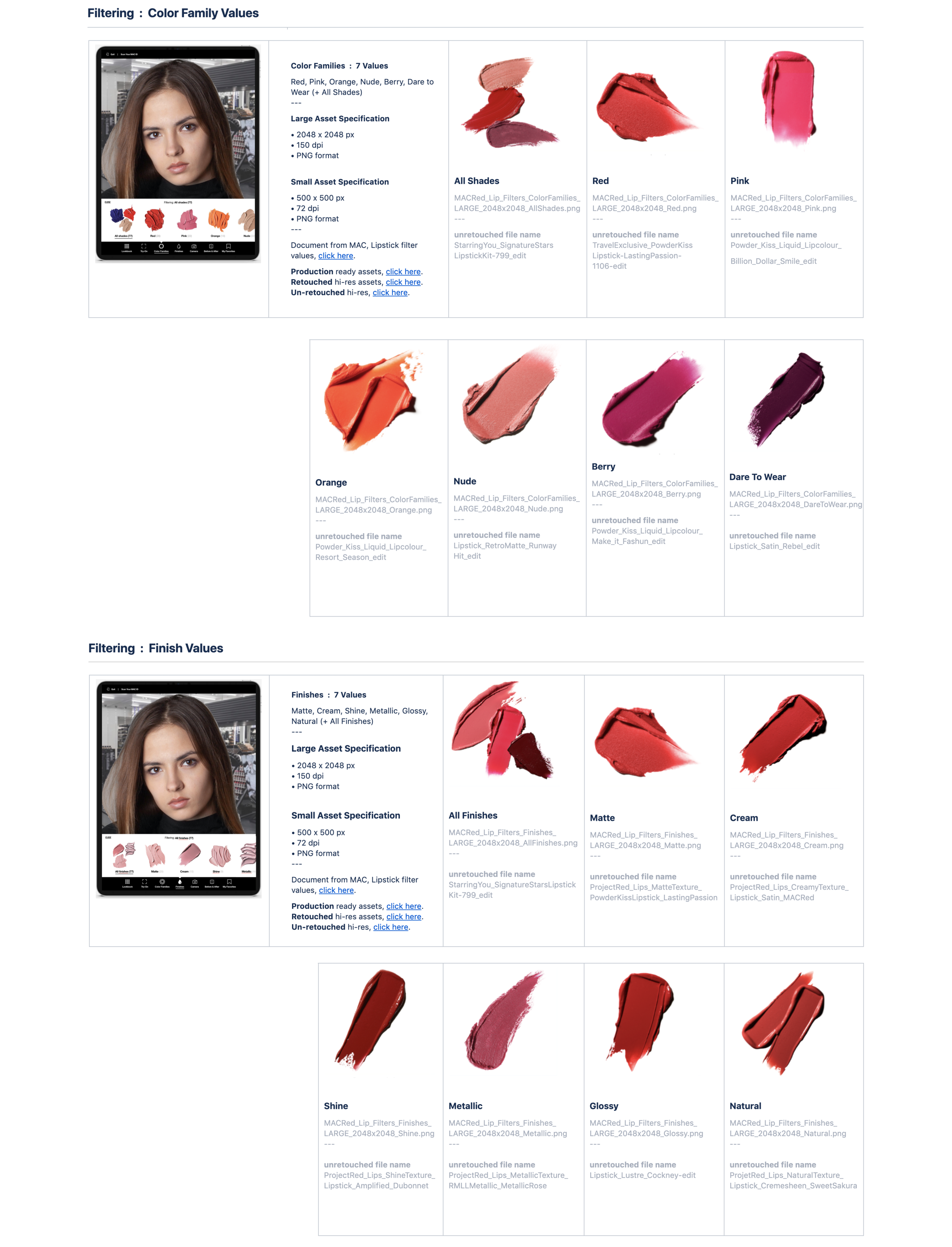
While assets were able to managed, there we of course other challenges. There was a small budget to shoot new content so a majority of the assets needed to be leverage and optimize from the website.
Cropping lipsticks
Scaling Products
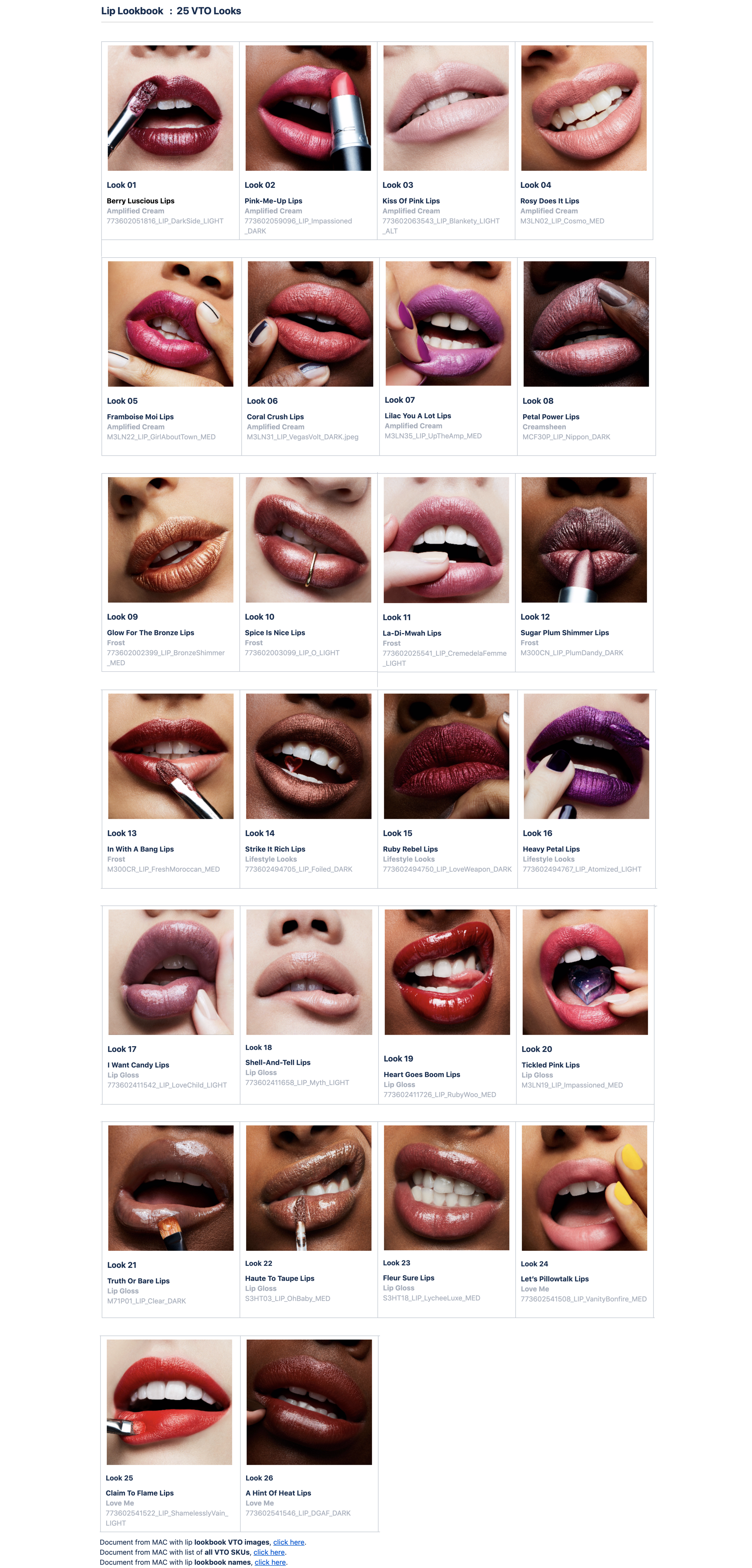
Associating products to looks
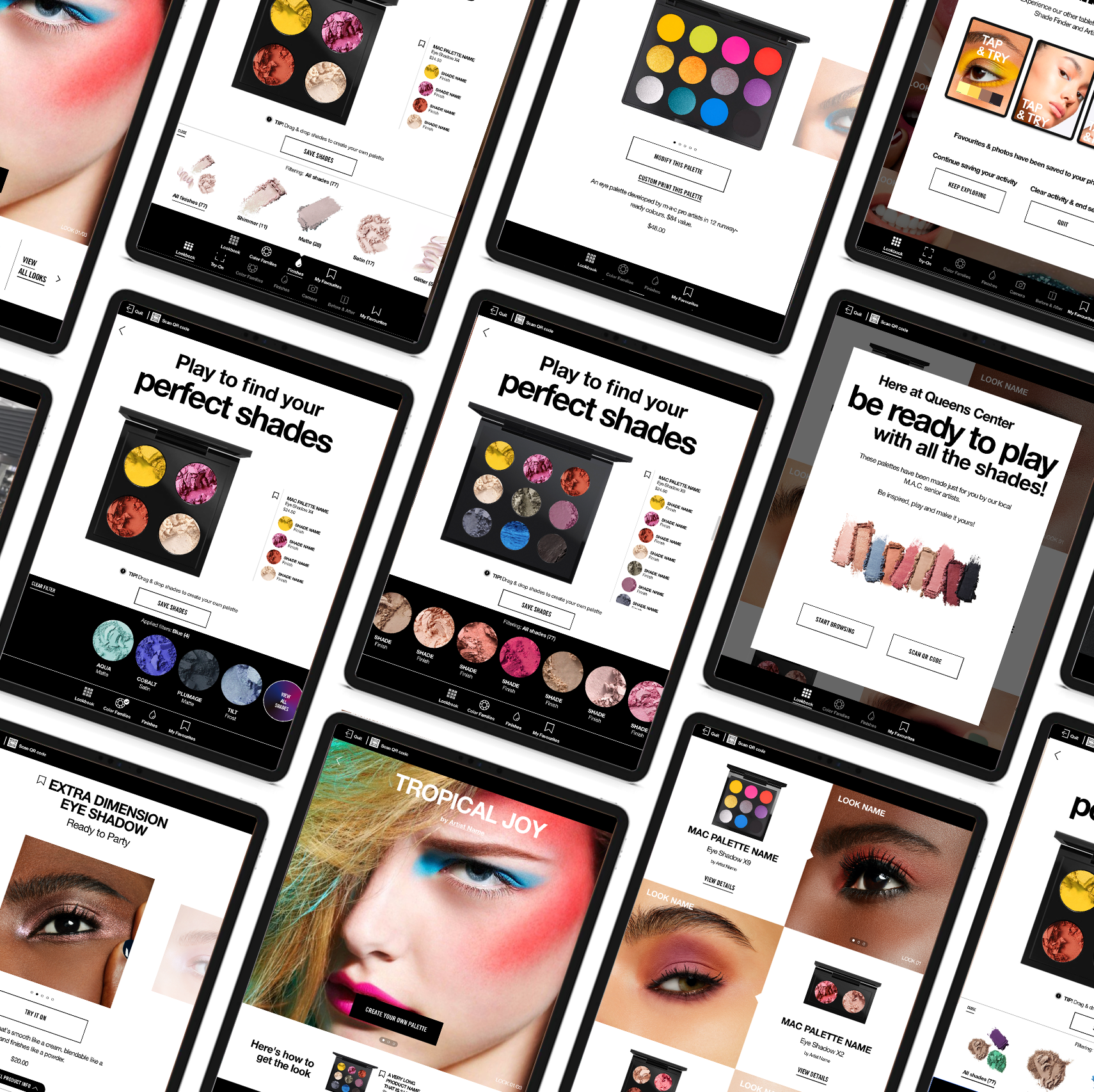
Final Experience Designs
As the planned content was being prepare for photography and production, the COVID-19 challenges required a strategy pivot, with little to no development rework. The solutions exceeded client’s expectation, while preserving the existing timeline for UAT testing.
▼ 5 Experiences : Tablet Designs
Next >
—— All Project Samples ——


