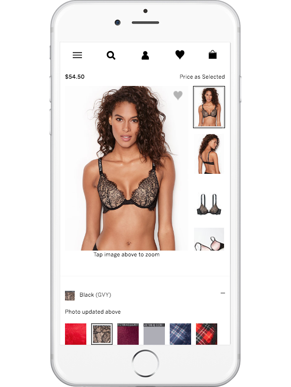
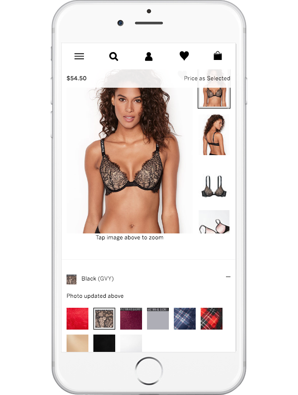
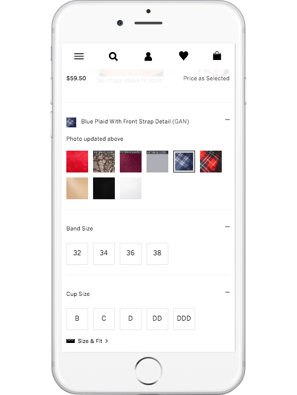
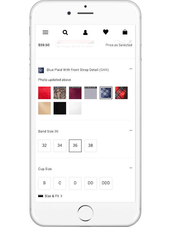
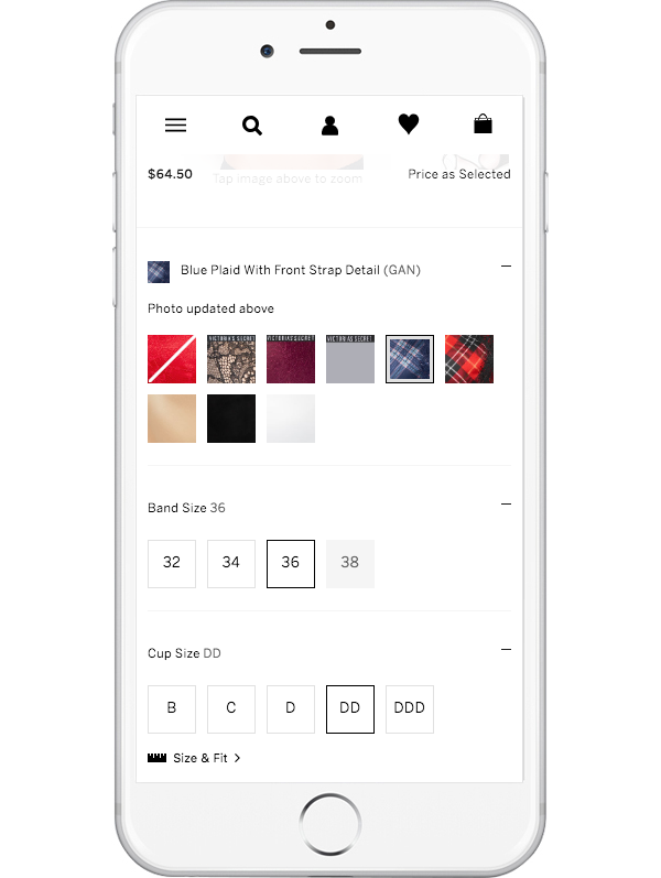
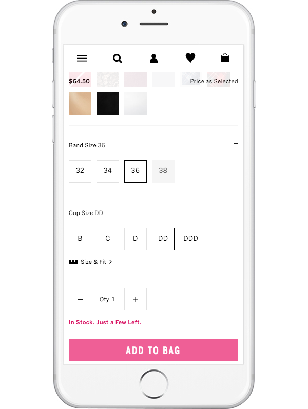
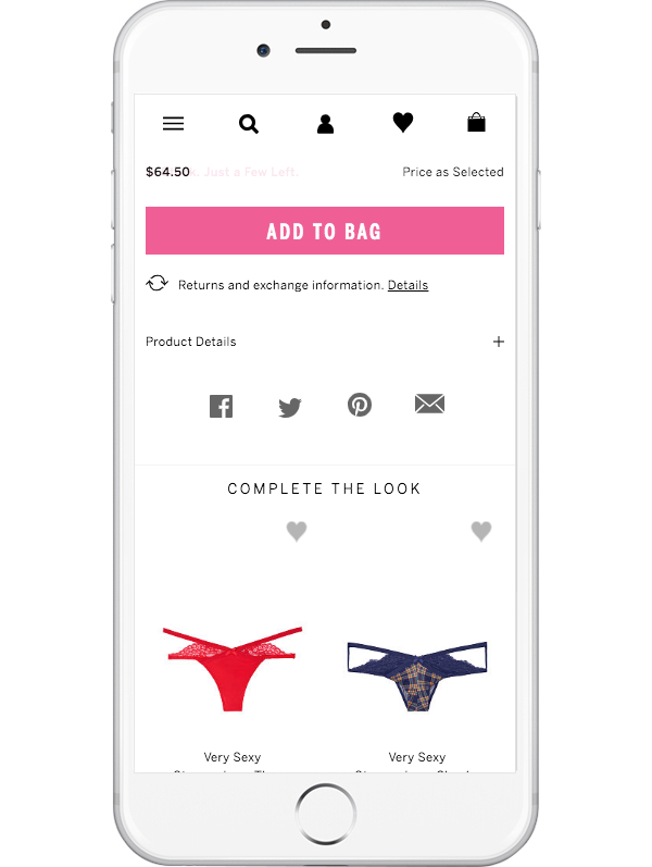
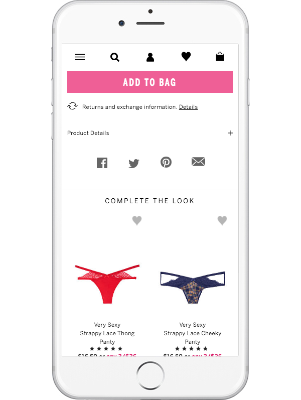
Ability to see price update dynamically as product attributes are selected.
UX Case Study
Roles
Regina Rakhlin - UX & UI Direction
Luis Escobar - UX & UI Lead
Product Team - Project Management & Development
Stakeholder
Victoria’s Secret Customer Care Center & Merchandising Team
KPI
Decrease calls to the Customer Care Center and increase customer satisfaction
What’s the Problem?
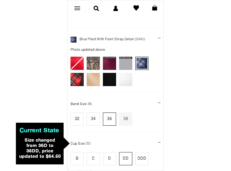
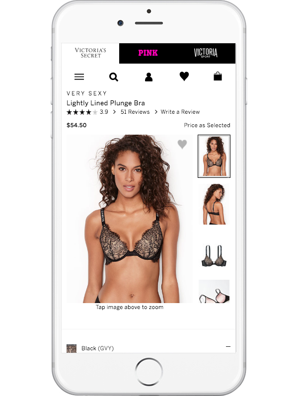
The business pricing model is such that color choice, size and style combination determines item price. Due to mobile’s small viewport, currently customers are not able to see price change while selecting product attributes. This results in customer care center calls to resolve the issue of dissatisfied customers.
Hypothesis
We believe by displaying product price simultaneously while customers select attributes will achieve their confidence in product cost.
We’ll know this is true when customer care center calls decrease related to unexpected price increase.
1. Understand
Customer Care Center describe frustrated customers having initial cost expectations, but then realize they were charged more. Product price initially is noticed, then the customer needs to scroll down to make attribute selections. Price is no longer visible and there is no knowledge that something changed after selections have been made.
2. Ideate
Seeing what other competitors do to solve this issue will help with ideas on how this challenge might be solved for this particular business model. Pricing structure for merchandise is complex. Curious if any other retailed has similar challenges to contend with.
3. Prototype
The competitive analysis informed the design explorations. During each design sprint, the prototype would be revised leveraging the usability findings. The goal was to create a solution which was:
4. Usability Testing
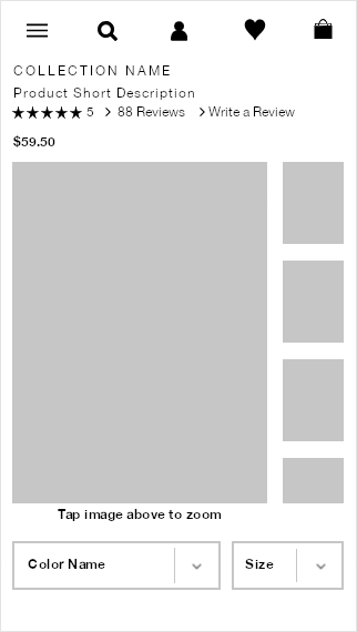
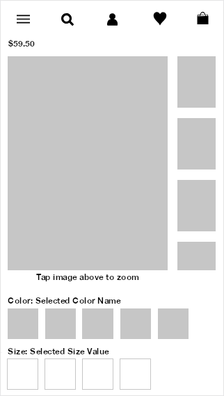
The prototypes were created based on the sketches below. A script for the usability tests was written by me and the UX designer, then it was reviewed with the usability team. There were 3 rounds of testing, analysis and design sprints to revise the prototypes and get to a validated solution.
Usability Results - 1st Round
A solution, but a very brittle one. Color swatches & size options would need to fit on a single row. Certain product categories, such as bras, split the size selectors into separate rows to easily see inventory availability.
Usability Results - 2nd Round
We moved the International Shopping control into the top menu, replacing the search icon (to maintain simplicity, see above). Six new participants interacted with the revised prototype. A majority were uncertain what the flag icon would control. Also, they wanted to search, but couldn’t figure out how.
Usability Results - Final Round
After more research and exploration the International Shopping control was placed in the footer (see above). The new participants successfully demonstrated their ability to complete the task with effortless confidence. This version went into development.
5. Results
The usability findings were share with the stakeholders, explaining how the customer feedback evolved the design solution. Due to the data, stakeholders were aligned with the results.
——
“This famous quote by Danish usability expert Jakob Nielsen underlines the thought:
Users spend most of their time on other sites. This means that users prefer your website to work the same way as all the other sites they already know.
——
UX worked closely with developers coding the experience. The design system was updated with new UI elements, components with new interactions were being created, all scenarios, screens, accessibility and legal compliance were being prepared for QA testing.
While the build was happening, we informed the rest of the product teams about this approved design, so they would consider how it impacts the rest of the site experience.
—-
Include Next Steps for all Case Studies
Final User Interface Layouts
—— All Project Samples ——


