Enhance international business by enabling effortless shopping.
UX Case Study
Roles
Regina Rakhlin - UX & UI Direction
Bridget Dearborn - UX & UI Lead
Product Team - Project Management & Development
Stakeholder
Victoria’s Secret International
Marketing & Design Teams
KPI
Increase product conversion outside the United States
What’s the Problem?
As the business has moved into international markets, the burden of site translation, currency conversion and limited shipping flexibility has fallen on the customer. Resulting in a less than optimal shopping experience.
Hypothesis
We believe by enabling preference controls for language, currency and shipping destination the customer will achieve an effortless shopping experience.
We’ll know this is true when product conversion increases for customers outside the United States.
1. Understand
Business insights and requirements were gathered from the stakeholders. Rough wireflow was created to understand the overall experience and scope.
Shipping restrictions
Shipping fees, duties, taxes, etc.
200+ destinations
5 languages
30 currencies
Scalable solution (without code release)
Control “prominently” located
2. Ideate
As a product team we decided to focus the initial design sprint validating the location of the preference control. To inform our design exploration an analysis was done of direct competitor’s sites preference control placement. Even though no clear trends were found, analysis for the majority was:
3. Prototype
The competitive analysis informed the design explorations. During each design sprint the prototype would be revised leveraging the usability findings. The goal was to create a solution which was:
4. Usability Testing
The prototypes were created based on my sketches below. I wrote the usability test script in collaboration with the UX designer, for review with the usability team. There were 3 rounds of testing, analysis and design sprints to revise the prototypes and get to a validated solution.
Usability Results - 1st Round
A sample of 5 participants interacted with the prototype and demonstrated difficulty locating the International Shopping control at the bottom of the mobile slide out menu. Based on these results, the location of controls needed to be reconsidered.
Usability Results - 2nd Round
We moved the International Shopping control into the top menu, replacing the search icon (to maintain simplicity, see above). Six new participants interacted with the revised prototype. A majority were uncertain what the flag icon would control. Also, they wanted to search, but couldn’t figure out how.
Usability Results - Final Round
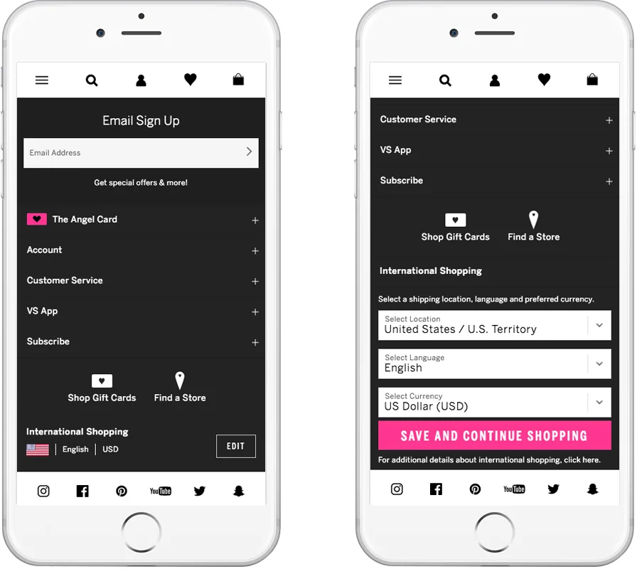
After further research and exploration the International Shopping control was placed in the footer (see above). The new participants successfully demonstrated their ability to complete the task with effortless confidence. This version went into development.
5. Results
The usability findings were shared with the stakeholders, explaining how feedback evolved the design solution. Based on the data and customer feedback stakeholders were aligned with the results.
——
UX lead and I worked closely with the developers on the outstanding scenarios, accessibility requirements and legal compliance. We also updated the design system with new UI elements and interactive components.
While the build progressed, we shared validated designs with remaining product teams so downstream customer journey impacts could be considered.
.
Final User Interface Layouts
—— All Project Samples ——


